2048-Style Basketball Grids in ggplot
Learn how to create a 2048-style grid in R and plot images in-line with plot titles
Uh, is this thing on? Anyways, welcome back to Buckets & Bytes! Can I say that I’m “reviving” this blog if I’ve only posted once? I’ve been chronicling some of my recent visualizations on GitHub, and I thought that I might as well start this blog back up — but expect shorter posts. There’s just no way that I can sustain 3,000-word tutorials, but I hope that this will still provide some semblance of value!
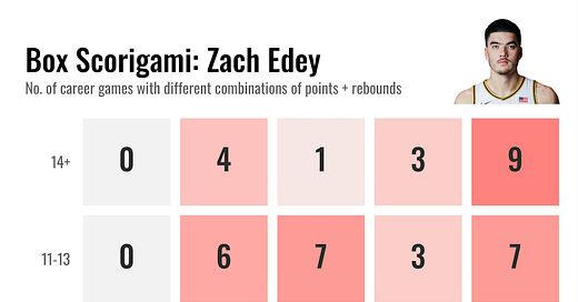
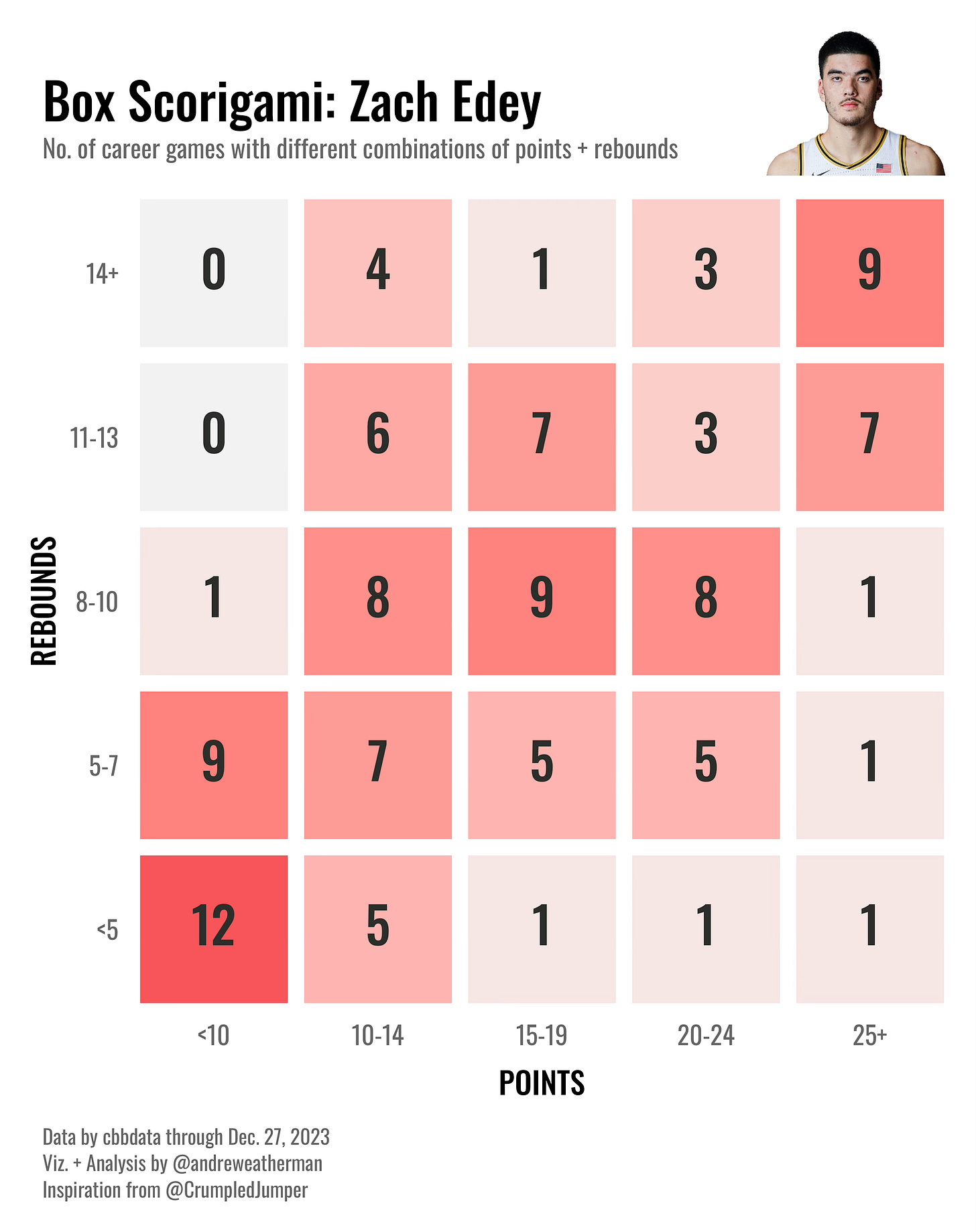
Today, we will be recreating a recent Todd Whitehead post. This is a neat grid that gives a creative spin on visualizing career distributions. I am really digging the 2048-vibe and the ‘Scorigami’ potential.
Let’s get started!
Getting the data
This visualization is going to use the {cbbdata} R package. If you missed it, I recently released cbbdata after eight months of development. To use it, you need to install the package, register for an API key, and set-up your credentials in R. Everything is entirely free, and the process takes less than one minute. You can learn more on the package website.
For this visualization, we are going to plot point and rebound combinations for Purdue’s Zach Edey — the reigning national player of the year and the odds-on favorite to repeat. You can choose a different player, and/or you can choose to plot different statistical combinations.
Let’s start by loading the required libraries.
library(tidyverse)
library(cbbdata)
library(ggtext)
library(nflplotR)
We need to define “bins” for point and rebound totals. After which, we will create new columns that define where each total falls relative to our bins. I am using increments of five for points and increments of three for rebounds. Feel free to play around with the data and find which bins work best for you.
data <- cbd_torvik_player_game(player = 'Zach Edey') %>%
  mutate(reb = oreb + dreb) %>% # fixes one `reb` NA
  select(player, team, pts, reb) %>%
  mutate(pts_bucket = case_when(
    pts < 10 ~ '<10',
    pts >= 10 & pts < 15 ~ '10-14',
    pts >= 15 & pts < 20 ~ '15-19',
    pts >= 20 & pts < 25 ~ '20-24',
    pts >= 25 ~ '25+'
  ),
  reb_bucket = case_when(
    reb < 5 ~ '<5',
    reb >= 5 & reb < 8 ~ '5-7',
    reb >= 8 & reb < 11 ~ '8-10',
    reb >= 11 & reb < 14 ~ '11-13',
    reb >= 14 ~ '14+'
  ))
We want to make sure that our plot includes point + rebound combinations that might be zero (not achieved yet). To do this, we are going to create a tibble with our bin definitions and use expand.grid to create a new object that includes all possible bin combinations.
bins <- tibble(
  pts_bucket = c('<10', '10-14', '15-19', '20-24', '25+'),
  reb_bucket = c('<5', '5-7', '8-10', '11-13', '14+')
)

bins_grid <- bins %>% expand.grid()
Next, we need to summarize our data to count the number of games where Edey achieved each bin pair. In other words, if Edey put up 15 points and 10 rebounds in one game, that would count for an observation with a 15-19 point bin and an 8-10 rebound bin. We are also going to join on our bins data after we count pairs so that our graph will include possible combinations that have not yet been achieved.
We are going to add levels to our bucket columns so that our plot axes are in the correct order (small → large). If you don’t do this, your bins (X-Y axes) will likely be misordered when you plot them.
plot_data <- data %>%
  count(pts_bucket, reb_bucket) %>%
  full_join(bins_grid, by = c('pts_bucket', 'reb_bucket')) %>%
  mutate(pts_bucket = fct(pts_bucket,
                          levels = c('<10', '10-14', '15-19',
                                     '20-24', '25+')),
         reb_bucket = fct(reb_bucket,
                          levels = c('<5', '5-7', '8-10',
                                     '11-13', '14+')),
         n = replace_na(n, 0))
Finally, we want to plot a picture of Edey, so we will grab his headshot from ESPN. You can get a headshot of any player by going to their ESPN college career page, right clicking on their headshot, and selecting Copy Image Address.
headshot = 'https://a.espncdn.com/combiner/i?img=/i/headshots/mens-college-basketball/players/full/4600663.png&w=350&h=254'Plot the data
That’s all of the data that we need! {cbbdata} makes accessing clean and tidy college basketball data in R a breeze. Now for the fun part: Let’s use {ggplot2} to create a 2048-style player grid for Zach Edey.
This plot is going to make use of the {nflplotR} package to render in our player headshot. If you are doing anything with team logos, I highly recommend using it. While the geom_from_path function is pulled from the {ggpath} package (same developer), {nflplotR} does include a very handy ggpreview function that is a life-saver when plotting multiple team logos. We will not be using that function in this code, but out of habit, I usually import {nflplotR}.
Custom fonts
We will be using the Oswald font from Google Fonts. If you do not have that installed on your machine, you can download it for free. If you are on a Windows machine, you might have to do a few more things to get your font to work with {ggplot2}. In my experience, custom fonts on Mac OS might only require an R session restart if you just downloaded Oswald.
Clipping and drawing outside of the panel
We want to plot the headshot “outside” of the coordinate system, i.e. above our plot and in-line with the title, so we need to specify coord_fixed(clip = “off”) — which will allow plotting outside of the panel (X-Y).
And specifically, we are going to set our x and y values inside geom_from_path to Inf so that our headshot is forced to the top right of our plot. We are going to use hjust and vjust to tweak the position of the headshot. If you are plotting a different player, be sure to adjust these values so that your headshot is properly positioned.
Theme
We adjusted a number of things in the theme function to get our grid to look just right. Most of what we did is mess around with margins to create distance between elements in our plot. If you aren’t exactly sure what each parameter does, I encourage you to change the values to see what happens!
plot_data %>%
  ggplot(aes(x = pts_bucket, y = reb_bucket)) +
  geom_tile(aes(fill = n), color = 'white', linewidth = 3) +
  geom_from_path(aes(path = headshot), x = Inf, y = Inf,  width = 0.25,
                 hjust = 1.05, vjust = 0.41) +
  geom_richtext(aes(label = n, color = '#2C2F2B'), size = 7,
                label.color = NA, fill = NA,
                family = 'Oswald-Medium') +
  scale_color_identity() +
  scale_fill_gradient(low = '#F2F2F2', high = '#F7565A') +
  coord_fixed(clip = 'off') +
  theme_minimal() +
  theme(legend.position = 'none',
        plot.title = element_text(family = 'Oswald-Medium',
                                  size = 20, vjust = 0),
        plot.subtitle = element_text(family = 'Oswald-Regular',
                                     color = 'grey40',
                                     size = 10, vjust = 0.5),
        plot.caption = element_markdown(family = 'Oswald-Regular',
                                        lineheight = 1.3,
                                        margin = margin(t = 20),
                                        color = 'grey40', hjust = 0,
                                        size = 8),
        plot.title.position = 'plot',
        plot.caption.position = 'plot',
        axis.text.x = element_text(family = 'Oswald-Regular',
                                   size = 10, color = 'grey40',
                                   margin = margin(t = -4, b = -4)),
        axis.text.y = element_text(family = 'Oswald-Regular',
                                   size = 10, color = 'grey40',
                                   margin = margin(l = -4, r = -4)),
        axis.title.x = element_text(family = 'Oswald-Medium',
                                    vjust = -3, size = 12),
        axis.title.y = element_text(family = 'Oswald-Medium',
                                    vjust = 3, size = 12),
        plot.margin = margin(30, 30, 30, 30),
        panel.grid.major = element_blank(),
        panel.grid.minor = element_blank()) +
  labs(x = 'POINTS',
       y = 'REBOUNDS',
       title = 'Box Scorigami: Zach Edey',
       subtitle = 'No. of career games with different combinations of points + rebounds',
       caption = 'Data by cbbdata through Dec. 27, 2023<br>Viz.
       + Analysis by @andreweatherman<br>Inspiration from @CrumpledJumper')
Saving
One more thing to note: When I was making this plot, ggsave was giving me lots of trouble, and I had to resort to using png to save it. If you experience similar issues, run the above code — ensuring that your graph is showing in your Plots pane — and use this to save it (replacing the file name as needed).
png('plot.png', res = 600, width = 7, height = 7,
    bg = 'white', units = 'in')
print(p)
dev.off()
Full code
And that’s it! The 2048-tile graph doesn’t take much to make, but it’s an effective, intuitive, and clean way of displaying statistic distributions for players. This code can be used to reproduce graphs for college basketball or as a general framework with which to build similar plots for other sports. My example uses a width and height of 7 inches and a DPI of 600 when saving.
library(tidyverse)
library(cbbdata)
library(ggtext)
library(nflplotR)


data <- cbd_torvik_player_game(player = 'Zach Edey') %>%
  mutate(reb = oreb + dreb) %>% # fixes one `reb` NA
  select(player, team, pts, reb) %>%
  mutate(pts_bucket = case_when(
    pts < 10 ~ '<10',
    pts >= 10 & pts < 15 ~ '10-14',
    pts >= 15 & pts < 20 ~ '15-19',
    pts >= 20 & pts < 25 ~ '20-24',
    pts >= 25 ~ '25+'
  ),
  reb_bucket = case_when(
    reb < 5 ~ '<5',
    reb >= 5 & reb < 8 ~ '5-7',
    reb >= 8 & reb < 11 ~ '8-10',
    reb >= 11 & reb < 14 ~ '11-13',
    reb >= 14 ~ '14+'
  ))

###

bins <- tibble(
  pts_bucket = c('<10', '10-14', '15-19', '20-24', '25+'),
  reb_bucket = c('<5', '5-7', '8-10', '11-13', '14+')
)

bins_grid <- bins %>% expand.grid()

###

headshot = 'https://a.espncdn.com/combiner/i?img=/i/headshots/mens-college-basketball/players/full/4600663.png&w=350&h=254'

plot_data <- data %>%
  count(pts_bucket, reb_bucket) %>%
  full_join(bins_grid, by = c('pts_bucket', 'reb_bucket')) %>%
  mutate(pts_bucket = fct(pts_bucket,
                          levels = c('<10', '10-14', '15-19',
                                     '20-24', '25+')),
         reb_bucket = fct(reb_bucket,
                          levels = c('<5', '5-7', '8-10',
                                     '11-13', '14+')),
         n = replace_na(n, 0))

###

plot_data %>%
  ggplot(aes(x = pts_bucket, y = reb_bucket)) +
  geom_tile(aes(fill = n), color = 'white', linewidth = 3) +
  geom_from_path(aes(path = headshot), x = Inf, y = Inf,  width = 0.25,
                 hjust = 1.05, vjust = 0.41) +
  geom_richtext(aes(label = n, color = '#2C2F2B'), size = 7,
                label.color = NA, fill = NA,
                family = 'Oswald-Medium') +
  scale_color_identity() +
  scale_fill_gradient(low = '#F2F2F2', high = '#F7565A') +
  coord_fixed(clip = 'off') +
  theme_minimal() +
  theme(legend.position = 'none',
        plot.title = element_text(family = 'Oswald-Medium',
                                  size = 20, vjust = 0),
        plot.subtitle = element_text(family = 'Oswald-Regular',
                                     color = 'grey40',
                                     size = 10, vjust = 0.5),
        plot.caption = element_markdown(family = 'Oswald-Regular',
                                        lineheight = 1.3,
                                        margin = margin(t = 20),
                                        color = 'grey40', hjust = 0,
                                        size = 8),
        plot.title.position = 'plot',
        plot.caption.position = 'plot',
        axis.text.x = element_text(family = 'Oswald-Regular',
                                   size = 10, color = 'grey40',
                                   margin = margin(t = -4, b = -4)),
        axis.text.y = element_text(family = 'Oswald-Regular',
                                   size = 10, color = 'grey40',
                                   margin = margin(l = -4, r = -4)),
        axis.title.x = element_text(family = 'Oswald-Medium',
                                    vjust = -3, size = 12),
        axis.title.y = element_text(family = 'Oswald-Medium',
                                    vjust = 3, size = 12),
        plot.margin = margin(30, 30, 30, 30),
        panel.grid.major = element_blank(),
        panel.grid.minor = element_blank()) +
  labs(x = 'POINTS',
       y = 'REBOUNDS',
       title = 'Box Scorigami: Zach Edey',
       subtitle = 'No. of career games with different combinations of points + rebounds',
       caption = 'Data by cbbdata through Dec. 27, 2023<br>Viz.
       + Analysis by @andreweatherman<br>Inspiration from @CrumpledJumper')


